Mud room bench, done!!

Friday, January 31, 2014 0 comments

HELLO! It’s Friday and the bench is done! Can I get an AMEN?

Last I left you it looked like this: DIY built in bench

Not bad but not done.

Like I said, it felt like all I had to do was paint those cabinets and slap on the hardware and I’d be done. But there was more. Lots more.

I’ve shared how to paint cabinets here but I’ll share the basics again today. Cause I’m in a good mood. :) I was starting with unfinished cabinets so I didn’t use a special primer, just a basic one:

tinted primer

So I experimented this time with a different color primer. Every time I prime unfinished wood it takes SO many coats to get nice coverage on it. So I tried using my tinted gray primer this time, thinking it would coat better at first, giving me a better base.

It did! But it still took three coats of white paint like usual. :) So it was a wash. But I learned. Something.

Anyhoo, after applying one coat of primer, be sure to sand everything lightly between coats:

painting cabinets

The primer and paint (mostly the first coat or two only) will pull up the grain on the wood:

painting cabinets

So you want to knock that down a bit.

So I used my basic white paint (off the shelf) I use for all of my trim and built ins but I could tell it was getting old. I noticed on the basement kitchenette that it was getting thick and hard to work with. So after attempting one coat on the bench I went out and got some new white paint, this time from Sherwin Williams:

proclassic sherwin williams

This ProClassic is AWESOME – I used this on our kitchen island and it’s held up GREAT. It’s their base white called Extra White and it went on SO easily and so smooth. Love it! (And no, I’m not paid to say that, I have just become a die hard SW fan over the past couple of years.)

I did three coats of white on the cabinets, then put the doors back on. It was then that I realized that the bottom trim looked like poo:

built in bench

It was flush in the middle and but not on the sides so it looked weird. I had some scrap trim that I used for the base so I just placed that right over it and I’m so much happier with it!

IMG_8207

Another big project was installing the trim around the top of the beadboard. Once I was done I knew I had to address the corners. I don’t have a table saw so I scored my beadboard down to make cuts to fit into the inside corners and outside corner. The result was crappy but I knew I would fix it:

 beadboard cornersbeadboard corners

See the big gaps? I use dowel rods to fill those in. I shared how I did it years ago on the kitchen island here. It’s the perfect solution since it just looks like the “bead” of the beadboard.

Now with the dowel rods and some caulk you can’t even tell there were gaps there:

IMG_8210 IMG_8211

After all that, and touching up some more paint, it was time to poly the bench:

poly on wood

I did one coat, sanded lightly and then did one more.

And here’s the final result…finally:

beadboard and built in bench in mud room

I still need to paint the trim around the doors, and a ton of other stuff. But the bench area is D.O.N.E. And I am H.A.P.P.Y.

I’m really proud of myself for making this happen. For the months years that I was planning this room I didn’t think I’d be able to do the bench myself. I knew I could build a bench, but a bench with storage I figured I’d have to hire out. I’m SO pleased with how it came together:

Bench made out of kitchen cabinets

That center panel I was worried about between the two cabinets is now hardly noticeable, with a lot of sanding, spackle and paint. :) If I could do it again I’d have the cabinets next to each other (and no space between) but I couldn’t figure out how to get them secured to the wall if I did that.

I’m in love with the hardware in here too – it was all from Lowe’s. I went simple with the hooks so I could fit them on the trim:

brushed nickel hooks

I originally planned on four along the back but decided on three there and then one on each side too. I need to go back and get one more for this side:

DIY mud room bench butcher block top

I figure the back ones will be for coats and bags and the side ones can be for keys and dog stuff.

I got a shot straight on with the help of my wide angle lens:

    IMG_8219  

SO HAPPY!!

Now…to decide on what’s happening above. I thought I had something in mind but now I need to think on it more. I want lots of storage up there so I’m just figuring out how much I want to be open and how much closed. (My plan is both.)

For now I’ll take a break on this space and just enjoy it! The cost for this area was about $300 – that includes the additional beadboard, the trim, the butcher block from IKEA and the cabinets. I used scrap wood for some of it too.

I am looking forward to adding some decorative stuff in here down the line – but for now just being functional is pretty awesome! Especially considering this space used to look like this ALL THE TIME:

Have a GREAT weekend!! Whoot! 

P.S. Here’s how I built the bench and here’s an in between update if you’d like more info on how I did this project.

My favorite appliance

Thursday, January 30, 2014 0 comments

Hello friends, it’s almost the weekend! Thursdays rock.

I was SO hoping to have the mud room (well, the part I’ve been working on) done to show you today but for all that is good, it is taking FOREVER. It seemed like a couple coats of paint were going to finish it up but it’s all kinds of little things. I really hope to have it done to share tomorrow.

Today I’m talking about something I’ve wanted to share for a while – my very favorite appliance. I like sharing what works well in our home (and what doesn’t) and this is one that I couldn’t live without. Well…I would survive – but it would be tough. :)

It’s not the fridge – although I do love it. It’s not the oven (boring), or even my beloved microwave, but instead the appliance that you may have seen in our kitchen island:

trash compactor built into island

(Yes the snow wall is still up. But I’m about over the snow outside so it’s coming down soon.)

So yes, it’s not the prettiest thing, and when my hubby and I built this house this was one of the things I fought against. The money was adding up and I was starting to freak out and I was all, who needs a trash compactor? Hello…it’s just an expensive trash can.

It is pretty spendy for a trash can but let me tell you – it ROCKS. Ours is ten years old and when we picked out appliances I did a mix of stainless and black, which I wish I could take back (and go all stainless). So it’s not something that’s easy to blend into the island, but it’s worth it:

trash compactor built into island

My husband had had one in an old house and loved it. I was skeptical. When we moved in and I looked at the inside and saw how small it was (I’m sparing you pictures of our trash, but it’s small), I was questioning this purchase even more.

And then we started using it and as I mentioned in the title of this post, it is now my most favorite appliance, hands down. Speaking of hands, you don’t use them to open it:

trash compactor

You push on the lever with a foot and it opens up, hands free.

Our trash compactor and the lever on our powder room toilet make for fun times when we have company over. No one knows how to use the trash can or the toilet. We’re great hosts. ;)

When the trash bag starts to get full you just turn the dial and it smashes the trash down. We only use one small compactor bag a week, if that. (That doesn’t include trash in the rest of the house, but the majority of it is in here.)

The only drawback to a trash can like this is finding the bags. You have to use special compactor bags:

trash compactor bags

They’re hard to find – we get ours at Sears and it’s the only place we find them locally. Thankfully we don’t need to buy them that often since we only use one a week.

So there’s more info about my favorite appliance. :) The built in compactor also solves the question of where to put the trash can – there’s not a great spot for one anywhere else in our kitchen.

And I just have to throw in a before of the kitchen island for kicks because it’s come SO far:

Do you have a trash compactor? We don’t know anyone else with one. They are very old school, right? Did you have one growing up?

The feeding station

Tuesday, January 28, 2014 0 comments

Hello from the tundra! It’s SO fun to wake up to icicles forming on the inside of your windows. Good times.

I’m planning to get a ton done on the mud room today – I don’t think I’ve ever progressed so fast on a room before. I know three months (so far) wouldn’t seem fast to most but it’s like light years for me.

When I added the bench in that room we lost space for something important in this house – the animal food. :) We have four animals and their food containers and bowls take up a lot of space. Originally I was planning on adding a feeding station in the mud room but there just wasn’t room.

So now I’m trying to figure out the perfect spot for all of it. We want it where we’ll see it all the time (to remember to keep them alive) but where we don’t have to step over it constantly.

For now we’ve moved the food and water next to this sofa table: long sofa table

This is an old pic but you get the idea of where it is.

But because I’ve had an animal every day of my life and I don’t see that changing in the future, I LOVE the idea of something built in. I gathered a few fun food storage and feeding ideas to share with you today. Some of them are ideas for down the line when we redo our kitchen, others could be done sooner than later.

I found a ton of ideas with the food bowls built in to a kitchen island. I like this one with the jars handy for food and treats:

built in feeding station island

Big SWEETIE.

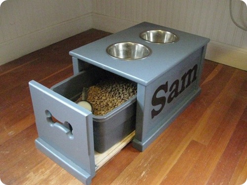
And THIS one, with the bowls and the drawers with the bone cut outs…I die:

built in dog feeding station island

I know with bigger dogs especially it’s important to have their food bowls up a bit higher to avoid bloat – I don’t know if it’s as big of an issue for little dogs but we have an elevated bowl for ours. I like how these are all built up a bit.

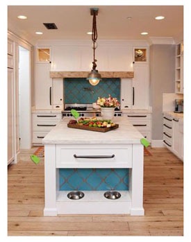
This one ties in the pretty design from over the oven:

built in feeding station island

Sorry for the small pic – by the way if you don’t see a source it’s because I couldn’t find one. If you know where these came from please let me know and I’ll add it!

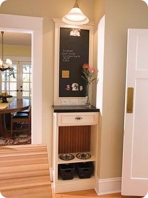
I love this idea because it shows that you can make a small area super useful:

9fe033986773eadd6a062e252e82961e

I love that these include some storage too – it would be great to have all the animal stuff in one spot, near the food.

This isn’t a feeding area but I loved it – I just wonder if the food would smell if you had it in a kitchen:

built in food drawer

In a mud room or laundry room it would be perfect. And we’d need two, one for the dog food and one for cat food. :)

OK, this isn’t a feeding area either but I couldn't’ resist it:

dog bed shoe storage

Dog and people storage/comfort all in one! (By the way, do you see the sisal rugs at the bottom of the shoe cubbies? Brilliant.)

This one knocked my socks off. I do believe that is a WORKING sink under there people:

built in feeding station animals

(source)

Oh my goodness, our cats would be in HEAVEN.

This one combines two of my favorite things in one – a window seat and smart storage:

built in feeding station for animals

(source)

I would just worry about having their water in there since we like them to have access to that all the time.

This one is just adorable and a lot less involved – no built ins needed:

dog food storage

(source)

SO cute. Too tall for our cats and Peanut but perfect for a bigger dog.

So until I have my dream kitchen with the perfect spot, I thought this was pretty brilliant and I could totally install it myself:

animal feeding station in wall

(source)

Anyone have one of these? It looks like the bowls can be pushed back up into the wall when not in use, yes? THIS is smart. Why don’t I think of these things?? They come in a few different colors too.

Do you have a great spot for the animal food? Any fun storage ideas? And where to put that cat litter…well that’s a whole other post. :)

Blocking the sun (new drapes)

Monday, January 27, 2014 0 comments

Hello all! Hope you had a lovely weekend! I had a great time out on Saturday with some friends and also got plenty of family time in too. It was a great one.

This week the posts will probably be up later like this one – it’s so cold here and will be all week so we’re expecting school delays most of this week. That means my kiddo doesn’t get off to school till almost 11 so it pushes my day back quite a bit.

Have I mentioned it’s cold? Yeah. I’m still doing OK with it – in another two weeks I’ll be about done.

So I’m thinking more about the master bedroom redo lately. I’ve made changes over the past six months or so – I started painting (and stopped, but now I know my direction and I’m going to start again), made a new headboard and made a couple other changes along the way.

I sold our old bed so I have $500 to spend on the redo and so far I’ve spent about $350 (including items from today’s post) to start the transformation. That includes bedding, the headboard, all new window treatments and some of the paint.

The only part of the redo that won’t be covered by that $500 are the new floors…which we decided we will go ahead with next month.

Lately my focus has been on the windows. Up till about Christmas they've been nekked (I took the old drapes down months ago) with only some wonky roman shades up:

The roman shades are about seven years old, maybe older. These are the shades I spray painted years ago. (Yes, spray painted.) The new color held up great – the shades themselves didn’t. You can see in that pic that the left one wouldn’t go higher than half way.

I got tired of the room being so dark during the day so I finally got some new ones over the holidays and hung them a few weeks back. This time I went higher above the window and did the outside mount instead of inside the actual window frame:

IMG_8143

In this pic they are pulled all the way up to top of the window – LOVE it. It lets so much more light in the room and also makes the windows feel bigger. (More on that in a bit.)

That was a big change but I knew I wanted something else to soften them up. I’ve had my eye out for drapery fabric for months but wasn’t finding anything that worked that worked with the busy bedding. I wanted something really simple and it wasn’t till I was in IKEA a couple weeks ago that I realized a solid color would be perfect:

sanela panels ikea

They are the Sanela curtains – they look like velvet and I got the dark gray. Because the roman shades are hung higher I needed to clear those so I went with the 118 inch drapes. ($70 for two panels.)

Turns out I had to cut about 17 inches off the bottom and hem them to make them work so I was thisclose to being able to get the cheaper (shorter) ones, but I’m glad I went with with these in the end.

Anyway. I had picked up a long drapery rod at HomeGoods a couple months back so I got that up yesterday. Hanging drapery rods is one of my least favorite jobs, really. It’s easy, just tedious. The hardest part is making sure you place the hardware in the exact same spot on both sides of the window. Once you get your measurements figured out, mark where you need to drill, then use a stud finder to see if you need to use anchors or not:

how to hang drapery hardwarehow to hang drapery hardware

You know Mama went out when the nails are painted. :)

The stud finders are sometimes wrong, so I always use a drill bit to make my holes first. If I hit wood I know I don’t need an anchor there. The finder said there was no wood in this spot, but when I drilled the top one hit wood:

how to hang drapery hardwarehow to hang drapery hardware  

Now that I show you in photos it seems like the easiest project ever, gah. Like I said, it’s not hard…just time consuming to get all the parts level and secure in the wall.

So these drapes have grommets and I LOVE them. I’ve never used grommeted drapes before and the fact that they hang so nicely and you don’t need rings/hooks is awesome.

Our window is so close to one wall (shakes fists in air at home builders) that I don’t even put the decorative finial on that side:

hanging drapery hardware

You can’t even tell when it’s up. Also, if you’re going to use your drapes (we are in here) then I always recommend placing one drapery ring (or in this case one grommet) on the end, on the other side of the hanging hardware. Does that make sense? This keeps that end of the drapes from moving when you pull them shut.

I love the pretty glass finials on this rod:

hanging drapery hardware

I used to go big and chunky with our window rods and finials but over the past few years I’ve moved to lighter and thinner.

I waited to take pics this morning which was DUMB. This room is impossible to photograph, especially in the morning, but this gives you an idea of how it came together:

hanging window treatments high above window

YES, the walls are still two different colors and YES I still haven’t finished painting the wall to the left, but I’m sure of what I’m doing now so I’m moving forward…finally. :)

Let’s just pretend the walls are all painted, OK?

I got them up and REALLY loved how they looked. They are sophisticated and a little sexy and I love them. When the walls are all the light gray they will stand out even more. I get a lot of questions about how well the bamboo shades filter light -- these are the shades I always get from Home Depot and they have a tighter weave then most:

bamboo roman shades

Keep in mind all that sun across the floor is from the reflection in the mirror.

In general I think they are fine without liners (I’ve found bamboo shade liners at Lowe’s), although there is one point in the morning when the sun moves across a sliver in the shade and is like a laser beam into my face, which I’m so not cool with. I wanted to make sure the drapes would be thick enough to block it out and our room was so dark this morning, it was awesome.

Here’s the same shot, same time of day with the drapes closed:

sanela ikea curtains

All that light is coming from the other side of the house. The room stayed nice and dark.

So quickly, here’s my thought on hanging window treatments high above a window. I think most of the time it really can make a huge difference – it can make a smallish window look and feel much bigger. Hanging my bamboo shades higher really does let a lot more light in too. BUT – I think sometimes doing this can look really awkward too. I recommend hanging your blinds/shades higher if you plan to hang your drapes higher too. Otherwise the illusion is ruined, if that makes any sense. You can see the true height of the window if the shades are hung using the inside mount and if you hang the drapes a foot higher it still makes the window seem small, you know what I mean? I think when both are hung higher than the window it comes together nicely.

You know, the real issues in life…where to hang your drapes. :)

I decided a while back that I wanted our bedroom to be more sophisticated then it’s been in the past, but also soothing. I’m usually not one to use similar tones throughout a room like this, but I’m loving how it’s coming together.

Once this wall is painted and the floors are redone I think it’s going to be really pretty, I’m really excited about it:

And YES I still have a magazine problem.

Other than painting I have a wall treatment idea in mind, I’m planning on a redo for that floor length mirror and I hope to recover the bench at the end of our bed. Lots to do but I’m happy with how it’s coming together.

Do you love roman shades or are you a blinds girl? Do you hang your drapes high or like them low?

Spray painted door knobs – the result

Friday, January 24, 2014 0 comments

Helloooooo. WHOOT for Friday! I’ve got a fun weekend planned and I’m stoked about it. The weather is supposed to stink so I’m crossing my fingers that everything goes as planned.

I wanted to do a quick update on the door knobs I spray painted a few months ago. I’m pretty sure I did this back in October – I shared how I did it here but the gist of it is that I primed the knobs with spray primer then did a couple coats of oil rubbed bronze spray paint:

spray painting door knobs

They looked great! This one was on the back door that we’ve since replaced, but I also did the knob on our mud room door and the result…well, it isn’t good. :)

Pretty much immediately we noticed the keyhole area was going to be an issue (which didn’t surprise me at all) and it went downhill fast:

spray painting door knobs

But honestly most of the wear is just from our hands, which did surprise me. The area around the edge of the knob is totally worn:

spray painting door knobs

OK, what’s interesting is I swear I primed both of these with black primer, at least I’m pretty sure I did? Maybe I did one with white? I don’t know because the worn parts are white. (Yes, I did start using white on one of them. The primer I love to hate.) So, if you do try this at home maybe use black primer only, that might help. 

The inside of the door where there’s no keyhole has faired a bit better – the edges aren’t as worn but the lock is:

spray painting door knobs

This is after three months of use and honestly it started wearing off almost immediately – I’d say within a couple weeks. So, ultimately I didn’t have great success with it. This knob is staying till I want to spend on a new one because it’s functioning just fine.

Things that may help – sanding them down will help the spray paint adhesion. I didn’t try that cause I thought it would be a pain, but honestly just sanding the edges may help. Also, I didn’t do a clear coat to protect it when I was done. I’ve never done that on anything I’ve spray painted and it’s held up fine, but not much gets this kind of use. That may help (but I still think that would wear off after awhile too.)

So there are the results of my spray paint experiment. :) I know some of you have painted your door knobs – did it work for you? If so what did you do differently?

Have a GREAT weekend!!