Well hello! I had planned to do a little DIY project to share today but then the stomach flu hit and I did pretty much nothing yesterday. I had been looking forward to getting a ton done too – the day was totally empty and I was going to be in beast mode. Instead I was on the couch all day, which just about kills me when I have stuff to do.
But I feel a million times better today! But instead of the DIY I’m sharing a post I’ve been meaning to write for some time now. I get asked about our paint colors a lot and try to keep up with them on my FAQ page but don’t update as much as I should. So I’m sharing all of our current colors in one post (and I will keep this on the FAQ page too).
It’s been awhile since we’ve seen my boy’s room on the blog:

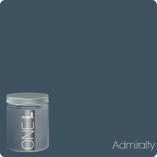
It’s because I’m still loving it and don’t want to touch it. :) I went dark navy on the top and that color is called Admiralty:

Of course these colors will look differently on your computer than they do in real life, and this one is no exception. Here it looks like a dusty, grayish blue and it’s not – it’s a true, deep navy.
The ceiling and the backs of the built ins are a Sherwin Williams color called Upward:

I am pretty sure I had it lightened just a tad, I think about 10 percent. It’s been almost eight years since I painted that ceiling. :)
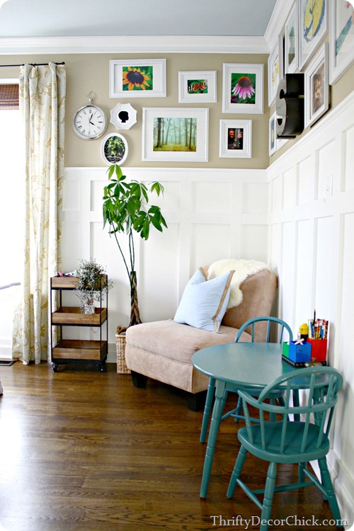
The color I get asked more than any, and is probably the number one question I get here on TDC, is the color of our family room and kitchen:

This is a color called Sisal from Ralph Lauren and I can’t find it anywhere online. I took a photo of the paint swatch:

It’s in their “Naturals” collection and the number for it is NA10. Home Depot used to carry it and I got it mixed there almost ten years ago when I painted these rooms. HD does not carry this line anymore but I believe they can find the formula, pretty sure anyway. Again, the picture is not quite right – the color is a bit deeper than that and a little more sandy looking. The photo above looks more gray and it’s not.
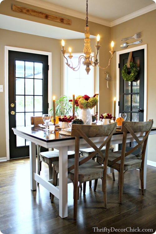
Here’s the paint color in our kitchen:

But it appears darker there than it is. The family room photo is a really good example of how it looks on the walls. Our kitchen and family room get great natural light so it works well in there.
I also used this color, just lightened 25 percent, in my office:

It’s a really great base for a room – it works with any accent color!
By the way, that ceiling color is called Purify from Dutch Boy. I can’t find it in their paint colors on line but here’s the formula:

Home Depot currently carries a Sisal from Martha Stewart that looks very similar to the one I’ve used:

This one appears to be a bit lighter than our walls but I like it a lot and it’s a good match otherwise.
A couple years ago we had half of our house repainted and it was just about the best day ever. :) Our two story foyer, living room, staircase and dining room and loft were all painted in Analytical Gray:


This is a Sherwin Williams color and here’s the swatch from their site:

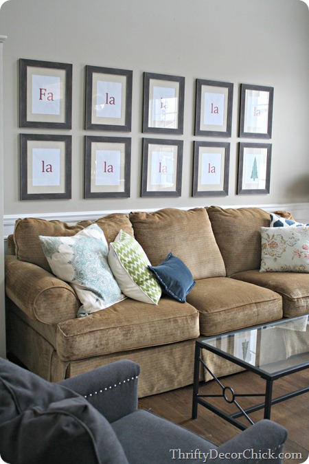
This is another great neutral – I LOVE this color. Some say they see some green in it in my pics – I can see that a little. The darker you go on the swatch it does go a little green. It’s a great “greige” – beige/gray color that’s a great backdrop for other colors.
I tried this same color in the main floor powder room and it was too dark, so keep in mind how much light you get in a room when using it. Instead I went with a similar color, Agreeable Gray in there:

Another one I love. This color is also from Sherwin Williams. Obviously over the years I’ve fallen hard for neutrals:

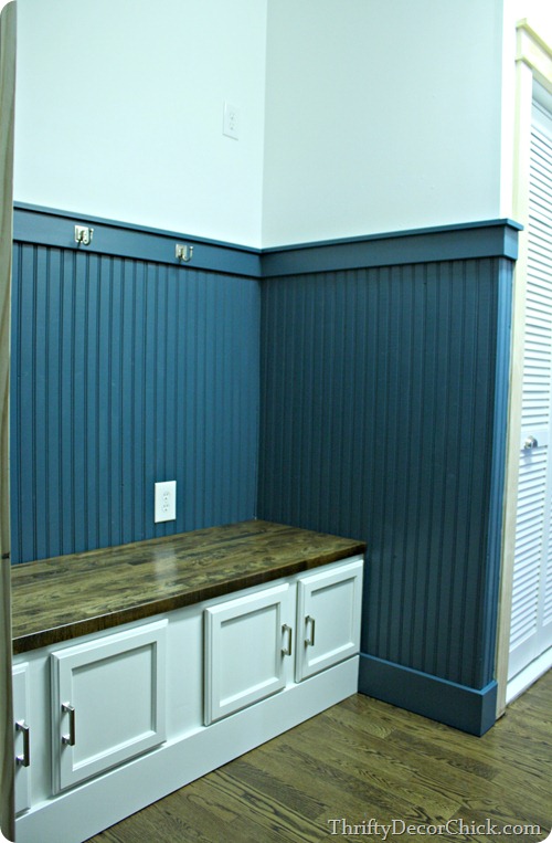
I did not go neutral in the laundry room turned mud room. :) I went with a deep peacock blue called Reflecting Pool by Ralph Lauren:

This is the only swatch I could find online and it has more of a green tint:

I went with a white on the walls, but it’s not a bright white. It’s called Stone Arrowhead by Dutch Boy and again I couldn’t find it online. This is the closest I found:

I finally painted my stepdaughter’s old room last year and went with a totally different color than what I would normally use:

It’s so light and pretty, I really love it.
The main color on the walls is called Dew White from Porter Paints:

And the colors on the square wall go from Dew White down to Pond Reed, as you can see on the swatch. :)
The master bedroom has had the same for about eight years now:

Most of the walls are a gray/green called Tornado Watch:

The wall above our fireplace is actually a bit darker color, called Mossy Aura.
Last year I started painting these walls and haven’t gotten very far. :) The wall behind the bed is now a light gray:

It’s called Whitestone from Benjamin Moore:
 The rest of the walls will get this same color as soon as I amp myself up to paint again. :)
Finally, another color I get asked about often, the basement color:

This one is called Marina Gray from Benjamin Moore and I had it lightened 25 percent since we don’t have any natural light down there:

I used similar tones for the laundry and bathroom down there, you can see those here. Since I lightened that Marina Gray the other colors I used down there don’t really look that much different. To most it probably looks like the entire basement is the same color. Ah well, lesson learned. At least I like it! :)
All the Ben Moore colors I mention are mixed in Sherwin Williams paints, just because I like the paint and they are a bit cheaper. All of the white trim or built ins in our home are painted in regular semi gloss white, off the shelf. Just a bright white, no specific color.
You can find links to all of these rooms over here if you want more info on any of them. :) Have you used any of these colors? Did I miss any?


