Dark gray accent wall

Monday, March 31, 2014 0 comments

Hello everybody! It is beautiful outside and I’m SO excited about the project I finished up this weekend! I’ve been planning it for some time now and I finally bit the bullet and got it done over Saturday and Sunday.

This one was all about the long wall behind our bed in the master. It’s looked like this for some time now, about nine months:

light gray bedroom

I painted it before we got our new bed and I installed the DIY headboard last summer. I was in such a rush to get it done I didn’t even cut in at the ceiling or the baseboards. And it sat.

I was telling a friend the other day that know when I’m not sure about a project when I let it sit for months. I’m talking six months to a year, or even years, like the powder room. If I’m loving the direction it’s going I’m pretty good at making it happen fairly quickly. (Granted, quickly in my time is still pretty slow.)

So I knew within a few months that I wasn’t feeling the light color on that wall, or I would have finished it up. I told you here how I was waffling between a dark or light bedroom – I love both! And I finally figured out how to make both happen. :)

I had been thinking of how to make that wall a little more dramatic and had a plan in mind. Then it was solidified when I saw Sarah’s wall in her office. Her dark wall was so striking, I loved it!

So that’s what I did. I was at the fancy mall a few months ago and the wall behind the cashier at Pottery Barn was a beautiful dark gray – I asked what it was and that’s when I knew Peppercorn was the color I would use:

peppercorn sherwin williams

I got the swatch a couple months ago and checked it in the room – it matched the dark gray in the rug perfectly and the new mirror over the fireplace too. It was meant to be!

I started by painting the wall Saturday – no cutting in needed, my favorite!:

dark accent wall behind bed

I had this mixed in an eggshell finish – I love a dark color in a matte finish but I wouldn’t recommend it. You’ll see every little scuff and want to be able to wipe it easily.

After the wall was painted I moved on to the trim work. I used simple mdf boards from Lowe’s – they come primed white. I got 13 boards so the total cost was around $80. I go back and forth on painting before installation and this time I did:

painting boards

But I’ve decided I still think it’s easier to just paint it all after the fact. You have to spackle all the holes and gaps and even though I tint it with the paint color, you still have to sand/wipe it down and then do at least one more coat after that:

mitered corners

And eventually I’ll probably caulk this whole wall (I haven’t yet) and I’ll have to paint over that too. So, I think I’ll always be a paint-after-install girl. :)

I did a “frame” around the whole wall – mitering the corners like you see above. Then I did a board and batten look on the rest of the wall:

gray board and batten

And I LOVE IT.

Like, stand in the room and stare at it, LOVE. My husband can't stop talking about it too, that’s when I know it’s a home run for us. :)

It is just perfect as an accent in this room. The headboard pops off of it even more than with the lighter color and even the navy blue lamps still look good:

dark wall behind bed

I never ever take pictures at night but I couldn’t resist – it looks so good during the day but I think I love it even more at night:

dark gray wall, wall trim

You can see above that the other three walls are still their original color – that’s the next step. They will be that light gray that was on the bed wall soon – as soon as I get the ladder and extender paint pole out. :) I’m SO excited about how this room is coming together now, I’m thrilled with it.

This is how it looks during the day:

dark wall board and batten

I still have to touch up smudges on the ceiling too, so ignore those. :) I couldn’t decide if I wanted to paint the base the same color as the wall, but I like it as is.

I planned the two segments on the wall so I could clear the headboard. I’m considering adding another line of the boards to make a third (bottom) segment – but I’m not sure. If I do it will mess with the headboard so I think I’m just leaving it:

peppercorn sherwin williams

It truly makes that wall a focal point now, which is what I think the room needed. Love it so much.

This room is really coming together now but there’s still a lot I want to do! The priority is to finally get the rest of those walls done – two coats on each wall which is going to be SUPER FUN. :)

Do you prefer a light or dark bedroom? I think when I’m done this will be a good mix of both. I especially love the board and batten look in this dark color – have you ever done something similar in a dark paint?

We’re off for spring break this week so I’ll be taking a few days to be with my family – I’ll be back Friday with a quick little DIY project for the closet! That’s another space I’m excited about! Have a lovely, warm(?), safe week!

Showing off Michelle!

Friday, March 28, 2014 0 comments

Hello and happy Friday! It’s spring break for us as well, whoot! It’s actually warming up just a bit, right on time. I’m looking forward to spending time with my boys and perhaps working outside a little. We’ll see about that last bit. :)

I’m highlighting another fabulous blogger today, this time Michelle from Iron & Twine! Her home is just lovely and homey and so pretty, I know you will love it!

Her living room is beautiful – love the mix of the colorful pillows and the neutral walls and furniture. It’s filled with personal touches too:

neutral living room

Everything works so well together, right? So well done.

I love her simple updates to regular items too – these were boring cardboard boxes before, and look what she turned them into!:

decorative boxes from cardboard

You can find the how-to here. So many possibilities with that project!

Her kitchen has been transformed with basics like lighting and paint – check out the before:

painting kitchen cabinets

And the after!:

painted kitchen cabinets

I have been doing this blogging thing for a long time and I am always amazed at the power of paint!

Her IKEA Expedit project was so simple but brilliant!:

ikea expedit chalkboard

This corner is now the ultimate organized space – love it!

And her mud room/studio had me drooling – it looks like a beautiful antique store, right?:

pegboard walls

I love how Michelle effortlessly combines the old and new to create such beautiful spaces. Be sure to check out more of her lovely home here.

Have a great weekend my friends! I’ve got a couple of DIY projects in mind – one big and one small. Hoping to get both accomplished. :)


P.S. I have the Pin It button installed but I ask that you visit Michelle’s site to pin any of these images.

The family room sectional

Thursday, March 27, 2014 0 comments

First of all, THANKS for all the thoughts on the bathroom ideas I shared earlier this week! Many of you with multiple kids mentioned our type of bathroom is a Godsend, which I can totally get. And I was so excited so many of you mentioned the solar tube skylights – I’ve been wanting to put those in our master bathroom for YEARS. I didn’t even think of them for that room so I’ll have to compare the costs of doing that and the window. And for some reason I thought you had to get them online but I saw them at Lowe’s yesterday – I’m so happy to hear they’ve worked well for so many of you!

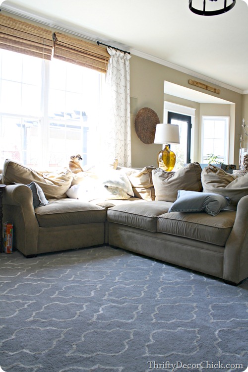
OK, next topic. :) I mentioned in the paint colors post that question I get the most is about the color of our family room. A pretty close second is about our sectional we purchased a few years ago:

sectional sofa

This is it for “real” – pillows smushed and back cushions smashed.

We got this sofa three years ago after paying off our massive debt. It was our first big purchase that we paid cash for and it was a GREAT feeling. I searched for months to find the right, quality sectional that would fit this room. We ended up with the Lansbury sectional from Arhaus and we LOVE IT. It rocks my world, still.

Many have asked how it’s held up and how the cushions do and that photo above shows that, yes, the back cushions do get smashed:

Mostly totally because of this guy:

It’s rare that he sleeps ON the seat cushions and not the back.

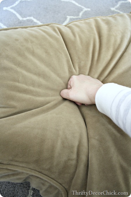
As you can see above they do get pushed out of shape:

fluffing up couch cushions

But thankfully it only takes a few minutes to get them looking good again. I LOVE this about this sofa.

I just put them on the floor and push my fists around on them to get them fluffed up again:

fluffing up couch cushions

I work the filling back into the areas that need it. It takes less than a minute to get each one fluffed up again. And honestly, I rarely do this. That level of smush is from about six months of the dog and cats walking and laying on the backs of the sofa. So it’s not something I do often.

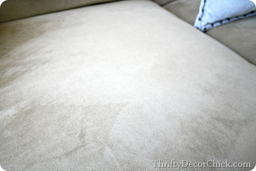
I am also in love with the fabric that we picked. I shied away from micro fabric, but when we were searching so many of you talked about how much you loved it. Our sofa is covered in micro denier, which is slightly different: micro denier fabric

I’m not sure exactly what the technical differences are but I’ve noticed two differences as far as using it – it’s incredibly soft, seriously like bunny butt soft. And it doesn’t leave quite the shadows that the micro fabric does. You know, the light and dark when you wipe your hand over it?

But this stuff is very much like microfiber in that it cleans up incredibly well. Every few months or so I’ll take a wet rag and just scrub any spots I see and they disappear. Here’s some frosting that I found, and how it looked right after I wiped it off:

 micro denier fabric micro denier fabric   

I never use any cleaners or chemicals on it – there’s just no need. Plain water gets everything out. (Although I have had it cleaned a couple times when we’ve had the carpets done over the years.) We’ve not had any major spills like red wine, so I can’t speak to that. But liquids do tend to bead up and not soak in, so that helps.

Also, our dog will occasionally “dig” at the cushions and so far we haven’t seen any damage from that. Also, the cats claws haven’t caused any issues either. It really is an incredible fabric and I would highly recommend it if you have animals or kids!

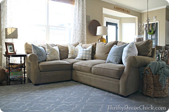
So after about five minutes of punching and rolling the stuffing in the back cushions, they’re back to looking brand new again:

small sectional

This sectional was probably our biggest furniture purchase ever – well, it was for one item. We spent just as much for a sofa and love seat (that obviously offer a bit more seating), but this one is easily the best purchase we’ve ever made. It will stand the test of time, I have no doubt in my mind.

I wanted a quality piece that we wouldn’t have to change out for years and this is it:

arhaus sectional lansbury

When we were on the hunt for a new sectional many of you shared your experiences with different brands on this post – check out the comments for some helpful info! At the time I was looking into Pottery Barn and IKEA as well.

Do you have a sofa or sectional you love? Any you’ve had good or bad experiences with?

The room you’ve never seen

Tuesday, March 25, 2014 0 comments

Dun dun dunnnnn. That sounded a bit ominous right?

I shared a bit of of this space back when I showed you how to switch out your door knobs but other than that I don’t think it’s a room I’ve ever shown on the blog. Mainly because I’ve hardly touched it for years now.

But I’ve been planning some big changes to this space for the past year or so, so I figured it was time to share the current pics (and some of my plans!). I decorated this room about eight years ago now – I honestly can’t remember if I did this when I was pregnant with our boy or if I did it after, but either way it’s been awhile and it’s looked the same since.

My stepdaughter also used this space for a long time and our guests use it too – I’m sure they appreciate the little touches I added. ;) This is one of those spaces that is not at all what I would do now but I’m proud of it and it brings back really sweet memories. It was done early on, just a couple years after moving into our home and every bit of it was done with love. (All of the rooms in our house are but the kid’s spaces give my heart that extra tug.)

I painted the walls a pretty yellow and the ceiling the same blue as the Bub’s room:

Bear with me on the lighting in here – it’s pretty horrible and the yellow walls don’t help. More on that later. :)

I installed the crown molding – the “cheater” way I showed you here – and a wall of beadboard as well:

No idea why I stopped with the one wall. I must have gotten tired.

I framed out the mirror with wood trim and went a little stencil crazy:

For a long time there was a little Goodwill medicine cabinet where the “E” is now but I replaced it about a year ago. I think that’s the one update I’ve made in all these years.

I added little touches like a little DIY towel hook and some letters in the shower room with what are supposed to be bubbles on them but have always looked like paw prints:

 kid bathroom towel hooks kid bathroom art

But there’s a big issue with this bathroom that I thought I would love at first. The whole separation thing – one “room” with the vanity and one with the toilet and shower – has not worked out well.

In fact, it drives me a little crazy. :) This isn’t a small bathroom (not very wide but it is long) but it feels SO tight because it’s broken into two spaces. That back room with the shower is so dark and small, we pretty much hate being in there:

I thought the separated rooms was so unique when we built the house, but within months I was cursing it.

So…I have a plan. The easy stuff first! I want to do one of two things to the vanity area -- cut down the countertop and place a tall, painted hutch or something similar there for storage. Or extend the vanity and make it twice as big. As of a couple years ago our cabinet design was still being produced, so I could just add on to the ones that are there. We chose one sink when we built and only need one – but for resale (someday, long time from now) I think adding another one may be worth it. I just need to see how much of a pain that would be.

One thing I know – I’ve wanted to paint the cabinets a navy blue for some time now, and Megan’s vanity convinced me:

navy blue vanity

Jen’s navy blue looks great too, I’m pretty sure this is the direction I’ll go:

navy blue vanity

I also considered a kelly green, but I think the dark blue is calling my name. :)

I want the vinyl floors gone and right now I’m planning on the laundry room tile instead:

IMG_6986

It was crazy affordable and I LOVE how it looks.

Of course the wall color will change, but I have no idea what it will be just yet.

But there’s a couple biggies I’d like to add too. One is a window above the shower. I know windows and showers don’t always mix, but I’m thinking a long, skinny one well above the shower, just to allow some natural light in this space. That back area especially is so dark and dreary. Are windows near showers asking for trouble?

And THEN…about a year ago I saw this photo in This Old House and I haven’t gotten it out of my head since:

taking down wall in bathroom

It’s hard to tell from the little before photo, but it was a similar set up as ours. This bathroom is much wider than ours, but the idea is the same. They took down the wall between the two rooms and opened it up – LOVE it. I like that this one shows the difference taking down that wall made without adding a window too – maybe we wouldn’t add one? (Adding a window is a big deal, at least it seems like it.)

And then I saw this bathroom at Houzz the other day and it made me even more determined to take down that wall:

taking down wall in bathroomtaking down wall in bathroom

I can’t even believe the difference it makes! That bath is a very similar size as ours and it looks twice as big without that wall.

I’ve ALWAYS wanted to knock down a wall in our house. I blame the DIY Network. This may be my chance to do just that! I’m giddy at the thought. :)

For the most part I’ve not focused on the rooms in our home that are supposed to bring more value – the kitchen and bathrooms. I’ve had big plans for our kitchen for awhile but I don’t know when it will happen, and our bathroom is totally functional so I’ve never made it a priority. And I know it will not be cheap! But I’m starting to get an itch to update these spaces – I think it must be the ten year itch. :)

Do you have a separated bathroom like ours? Do you love it or hate it? Any windows in the shower people who want to chime in?


P.S. The pin it button is now on all of my photos but I ask you visit the original source to pin from there.

No sew bench cushion

Monday, March 24, 2014 0 comments

Hello everybody! Hope your weekend was great – I was SO sick most of it which was a bummer. I get a horrible cold every year this time of year and I think they’re getting worse as I get older. This one was a doozy. I felt a little better in the evenings and like a new person last night, so I got this project done during those times I wasn’t on the couch. :)

I’ve been working on our mud room a lot this year and I’m loving it. It’s different for me – lately I’m going for lighter, more subdued colors on the walls, but this room is FULL of color. I like to start with some sort of inspiration for each space and this one was based off a rug I found at HomeGoods:

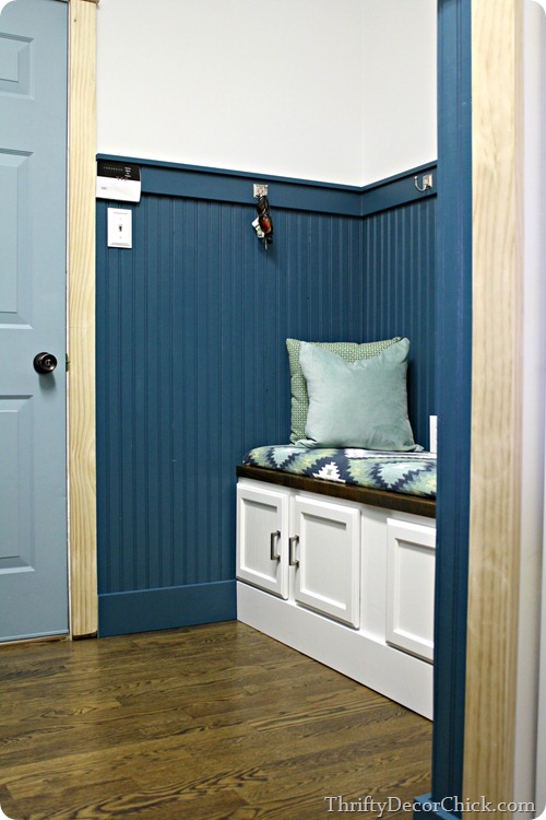
I picked the blue color on the beadboard from this rug (Reflecting Pool by Ralph Lauren). I LOVE all of these colors and love them together.

These thin rugs come in so many fun designs (I’ve seen quite a few of them at HG) but I don’t actually use them as a rug just because of how thin they are. Even with a rug pad they don’t stay put for me and I end up tripping all over them.

So I had a plan all along to use this one in a different way – as an upholstered cushion for the bench. If you’re really good you know how to make a real cushion, but I do it the cheater way. :) I’ve done this a few times and it always works well.

I grabbed some scrap mdf from the garage and cut it down a little smaller than the rug – it was already about 19 inches wide and I cut it down to 42 inches. Instead of using expensive, thick foam from the craft store, I used my egg crate foam that you use on the bed:

no sew bench cushion

I showed you how I use this on my upholstered headboards here too.

In the fall the twin foam pads will go on clearance and you can get them for super cheap. WAY cheaper than thick foam from the store. I used hot glue to secure it to the wood, then used an electric meat knife to trim it down:

cutting foam

I think I saw that idea like ten years ago on Trading Spaces and it works GREAT. Cuts like buttah.

I put another layer on top, this time with the textured part facing down:

no sew bench cushion

You can see I had to piece it together – since the rug is so thick you don’t even see where they were put together when it’s all done.

To make it nice and smooth I wrapped the whole thing with scrap muslin that I had:

no sew cushion

You don’t want to pull too tight because the edges won’t be even. If you pull it crazy tight you’ll have bumps in between where you stapled on the back.

I did the same with the rug and made sure to center it right on top:

rug on upholstered cushion

I did the two short ends first, then the sides, then the corners last. I knew the corners would be tough with this because it’s so thick. I had to cut a lot of the corners down under there so it’s not pretty – but nobody will see it. :) It’s secure and staying put and that’s all that matters.

It turned out just as I saw it in my head all those months ago:

cushion from a rug

It doesn’t go the whole length of the bench and I knew that going in – I wanted some of the bench to be open so we can set stuff down if needed. I don’t know if we’ll keep the cushion off to the side or in the middle, but for now I’ve got it here:

mud room with beadboard

No, the door trim is still not painted. I’m getting myself amped up to do it. :)

The aqua pillow was one I found at World Market a few months ago and the other one is an outdoor pillow that used to be up in the loft. That one probably won’t stay but the colors are perfect match too: DIY no sew cushion

Now that I see this aqua with that blue I want the door to go more that direction. Now it’s just a light blue I had in my paint stash. I think a slightly more aqua color would be fun. Who knows – I’ll decide when I get the trim painted white.

I’ve mentioned before how AWESOME it has been to have this space finished now – it’s such a night and day difference from the mess that used to be here. The coats are not hanging now because I’ve hung them in the closet. We only need them for three more days this week and then I think spring will actually be here. (!!)

I refuse to look at them anymore so they’re out of sight:

beadboard mud room

I thought I knew what I wanted to do on that big wall above the bench but when we tried it out it looked goofy. So I’ve come up with a new plan for all that wall space that I hope to work on soon: DIY bench mud room

Stay tuned for more on that. Other than that and the door trim I still want to install a new light fixture (we have a long fluorescent light in there now), perhaps add some additional lights (I need to see if my idea will work) and install crown molding. And then figure out what to put on the walls to add more of “us” to this room.

I’m so happy with how it’s coming together so far! Have you ever used a rug for something unexpected like this? Can you sew a cushion or have you tried a DIY version like this?