Hey hey! I’m back today with a couple fun house tours for you – one of my very favorite things to do is walk through model homes. I even have my boy hooked on it. We’ll be driving through a random neighborhood and he’ll ask if we can “walk through the houses.” Yes, I am raising him right.
The Indianapolis area used to have a Home-a-Rama tour every year that my friend and I would attend, but for the past few years I haven’t heard of anything. It was a major bummer. Maybe they had been happening and we just didn’t hear, but I even searched online a couple years back and couldn’t find any shows.
So I was thrilled when I picked up our local magazine last week and saw there was a new one going on. I thought I’d share some of the houses with you! There were four but I took a ton of pics, so I think I’ll break this up into two posts.
Thing is, the old home tours (years ago) were extremely elaborate. I’m talking huge, gorgeous, over-the-top homes. Man I wish I still had pictures of some of those. I could tell this year that things are just changing – these homes were still big square-footage wise, much bigger than our house, but the floor plans didn’t make them feel huge. And the decor was beautiful and well done but just wasn’t as elaborate as the old shows.
The first home was an all brick exterior in what they called an Italian Renaissance style:
It felt very imposing to me – not my favorite. The brickwork was beautiful though.
I tried to cut down on the pics so bear with me here. I loved the bright kitchen with the dark gray kitchen island:
This look is one I’ve probably pinned a hundred times. :) I adore it but would need to add more color in my own house.
I find the layout is generally the same in a lot of these homes – but the difference in houses in this price bracket is in the details. The doors are heavy solid wood, the cabinets are soft close. The hardware is heavy and HUGE:
Check it out – those handles are massive!
I loved the brick flooring look in the mud room and the wood tile in the basement:
That brick look is actually a tumbled stone, not brick. So it was smooth to the touch – easy to clean! I really loved it! It brought a lot of character to the space. That wood tile in the basement is definitely cool – but also a little too cool for me. Literally. ;) I love the warmth of wood (on my feet).
Usually the basements on these tours are spectacular, and these were still fun but not crazy decked out like years back.
I LOVED the brick walls with the holes for the wine in this basement:
How cool is that? Not sure that could be DIY’d but I dug it. I liked the black cabinet and gray subway tile combo too.
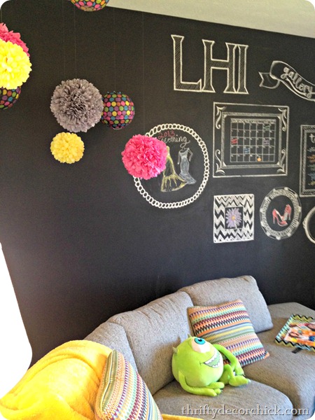
I thought this multi-purpose room with the chalkboard wall was cute:
I loved the bright colored poufs with the black wall.
I noticed that all of the master bedrooms were surprisingly small. Seems to the trend too:
I do think some of the masters in new construction over the past ten years or so are ridiculously big, but these felt a little cramped to me, even with just a few pieces of furniture.
I loved the big shower in this house:
Loved the tub too, but the placement was odd to me. It was just kind of out in the middle of the room. Very exposed. ;)
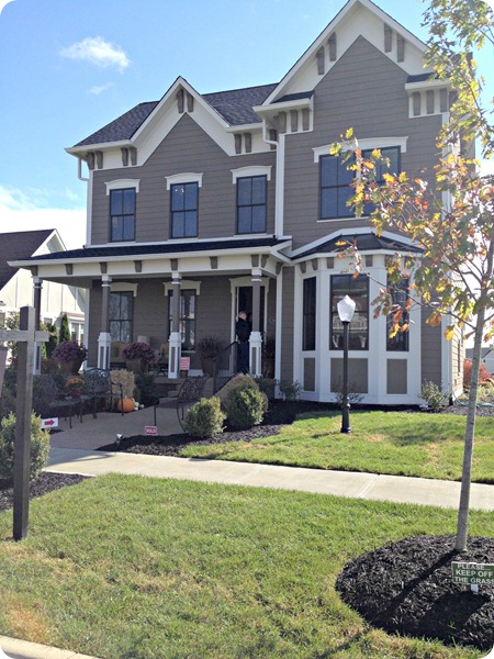
The second house had a much more traditional look:
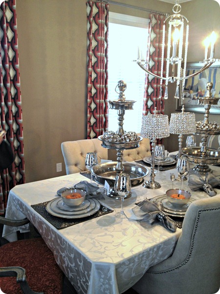
And yet the inside was more contemporary – I expected it to have a warmer feel:
I did love this nook in the kitchen – they had it built out as a homework/crafting station:
I thought this clipboard idea was adorable!:
Just secure them to the wall and you can easily clip new stuff to each board.
This idea was pretty darn cute too:
Your very own pumpkin patch! ;)
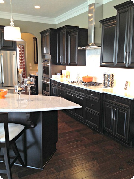
I loved the black cabinets in the kitchen – they added to the contemporary feel:
The kitchen table and chairs and stools were all dark too, so it did get a little heavy in there. But the multiple huge windows made up for that. ;)
The family room area was done in gray and orange:
The rug was super cool, loved it.
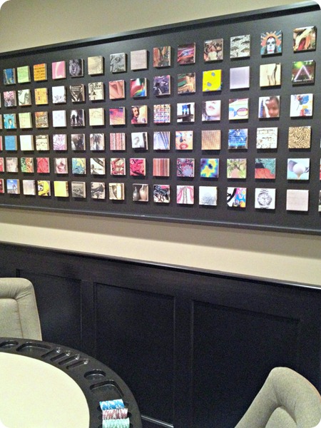
I thought this art in the basement was such a fun idea!:
It looks like Instagram art, right? They used graphics but I thought this would be SO cool with Instagram pics. Each square was a little piece of wood that was velcroed on, so you could change them out. You could do this with wood and photos printed on paper then mod podge them on.
Now I’m trying to think of where I could do this. :)
One of the rooms upstairs had a super cool bunk wall built in:
The Bub LOVED this room. There were little cubbies complete with outlets in each bunk. Although there would need to be a bar up there on that top bunk to help me sleep at night. (These ceilings were high!!) I keep debating bunk beds for my son’s room – I think they’d give him so much more space but they freak me out a little. :)
The master bathroom had a REALLY cool tile used as an accent:
It was like a bubble tile – the circles were raised and we couldn’t stop touching it. SO much fun.
This bathroom also had a little something else I loved – a little coffee/kitchenette station:
Certainly makes me wish we liked/drank coffee. Would a hot chocolate station be over the top? Maybe.
Well there’s the first two! I’ll share the last two soon. (The very last house was my favorite!) I think the show is still going next weekend if you’d like to attend. I didn’t even scratch the surface with these pics of course – there’s SO much more to see.
Which one was your favorite? Anything you loved? I think that kitchen in the first house is my favorite room so far. :)
House one was built by Brookshire Homes, decorated by Luxe Home Interiors.
House two was built by DB Klain Contruction, decorated by Savvy Decor.










0 comments:
Post a Comment